# StatusIcon
The StatusIcon component is used to add an icon that represents one of the following statuses:
- success
- info
- warning
- danger
To use this component:
- Import it into the single file component (SFC)
- Add the
<status-icon />tag - Add the optional status prop and set the value to one of the statuses
- Add the translated text to associate with the icon
import StatusIcon from '@/components/Global/StatusIcon'
# Status icon with default status
<status-icon />

# Status icon with success status
<status-icon
:status="success"
/>

# Status icon with info status
<status-icon
:status="info"
/>

# Status icon with warning status
<status-icon
:status="warning"
/>

# Status icon with danger status
<status-icon
:status="danger"
/>

# Example of AppHeader with status icon

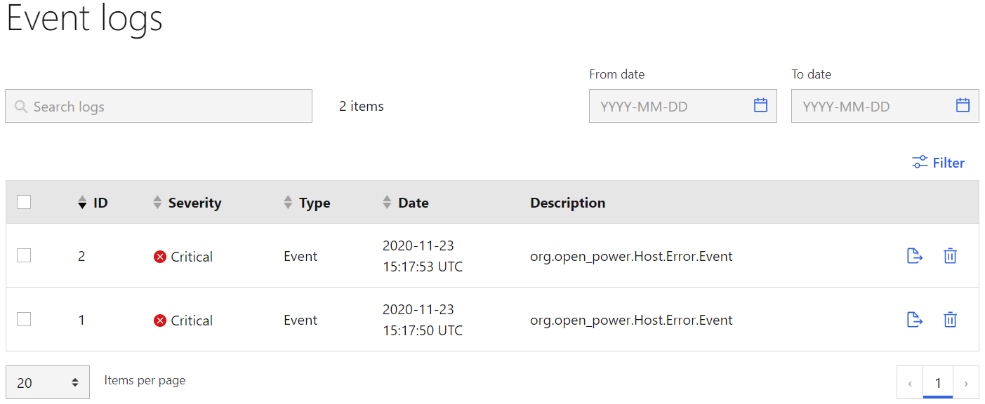
# Example of Event logs with status icon
← Page title Table →