# Table
All tables in the application are using the BoostrapVue table component (opens new window).
To use the component, include the <b-table> tag in the template. The component
is registered globally so does not need to be imported in each SFC.
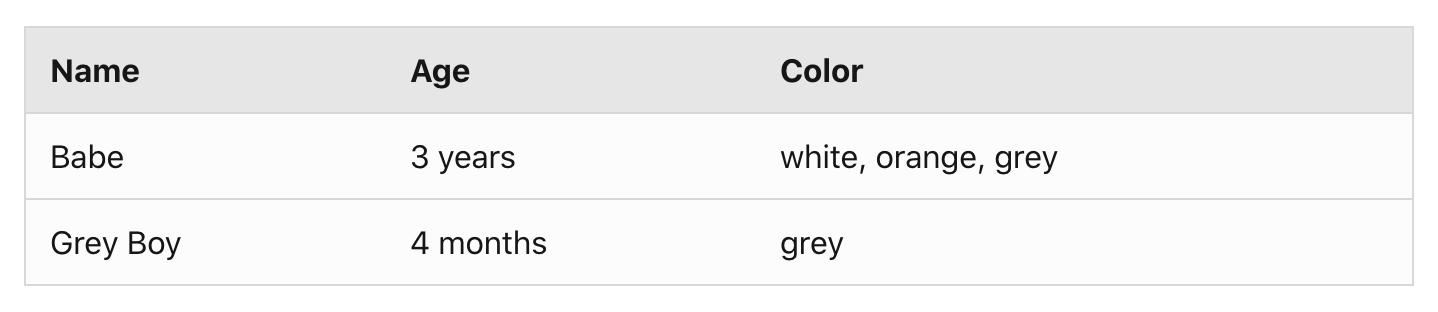
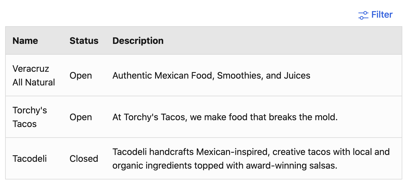
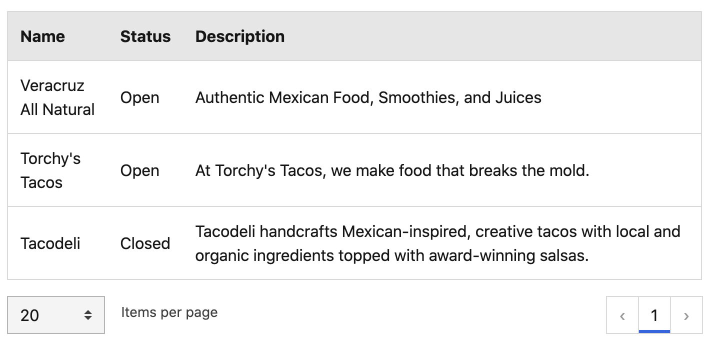
# Basic table
There are a few required properties to maintain consistency across the application. The full list of options can be viewed on the Bootstrap-vue table component's documentation page (opens new window).
# Required properties
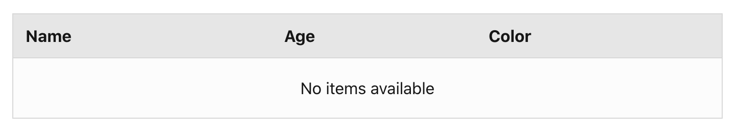
items- renders table itemsfields- renders table headerhover- enables table row hover stateresponsiveorstacked- makes the table responsive (enables horizontal scrolling or stacked view) at the defined breakpointshow-empty(required if table data is generated dynamically) - shows an empty message if there are no items in the tableempty-text(required if table data is generated dynamically) - the translated empty message
<template>
  <b-table
    hover
    show-empty
    responsive="md"
    :items="items"
    :fields="fields"
    :empty-text="$t('global.table.emptyMessage')"
  />
</template>

<script>
  export default {
    data() {
      items: [
        {
          name: 'Babe',
          age: '3 years',
          color: 'white, orange, grey'
        },
        {
          name: 'Grey Boy',
          age: '4 months',
          color: 'grey'
        },
      ],
      fields: [
        {
          key: 'name',
          label: this.$t('table.name') //translated label
        },
        {
          key: 'age',
          label: this.$t('table.age') //translated label
        },
        {
          key: 'color',
          label: this.$t('table.color') // translated label
        }
      ]
    }
  }
</script>
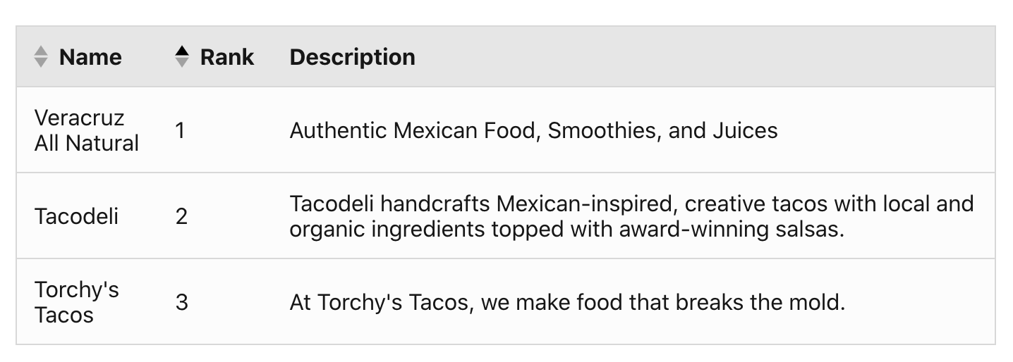
# Sort
To enable table sort, include sortable: true in the fields array for sortable
columns and add the following props to the <b-table> component:
sort-byno-sort-resetsort-icon-left
<template>
  <b-table
    hover
    no-sort-reset
    sort-icon-left
    sort-by="rank"
    responsive="md"
    :items="items"
    :fields="fields"
  />
</template>
<script>
export default {
  data() {
    return {
      items: [...],
      fields: [
        {
          key: 'name',
          label: 'Name', //should be translated
          sortable: true
        },
        {
          key: 'rank',
          label: 'Rank', //should be translated
          sortable: true
        },
        {
          key: 'description',
          label: 'Description', //should be translated
          sortable: false
        }
      ]
    }
  }
}
</script>
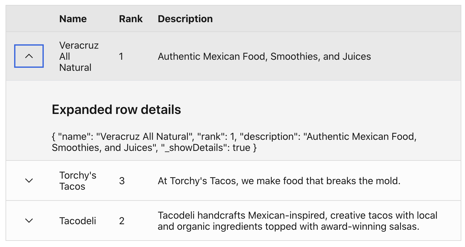
# Expandable rows
To add an expandable row in the table, add a column for the expand button in the
fields array. Include the tdClass table-row-expand to ensure icon rotation is
handled. Use the built in cell
slot (opens new window) to
target the expand button column and add a button with the chevron icon.
Include the
TableRowExpandMixin (opens new window).
The mixin contains the dynamic aria-label and title attribute values that
need to be included with the expand button. The toggleRowDetails method should
be the button's click event callback. Be sure to pass the row object to the
function.
Use the row-details
slot (opens new window) to
format the expanded row content. The slot has access to the row item property.
# Summary
- Add a column for the expansion row button with the tdClass,
table-row-expand - Include the
TableRowExpandMixinto handle the dynamic aria label, title, and row expansion toggling - Use the
#cellslot to target the expandable row column and add the button with accessible markup and click handler - Use the
#row-detailsslot to format expanded row content
<template>
  <b-table
    hover
    responsive="md"
    :items="items"
    :fields="fields"
  >
    <template #cell(expandRow)="row">
      <b-button
        variant="link"
        :aria-label="expandRowLabel"
        :title="expandRowLabel"
        @click="toggleRowDetails(row)"
      >
        <icon-chevron />
      </b-button>
    </template>
    <template #row-details="row">
      <h3>Expanded row details</h3>
      {{ row.item }}
    </template>
  </b-table>
</template>
<script>
import IconChevron from '@carbon/icons-vue/es/chevron--down/20';
import TableRowExpandMixin, { expandRowLabel } from '@/components/Mixins/TableRowExpandMixin';

export default {
  components: { IconChevron },
  mixins: [ TableRowExpandMixin ],
  data() {
    return {
      items: [...],
      fields: [
        {
          key: 'expandRow',
          label: '',
          tdClass: 'table-row-expand',
        },
        ...
      ],
      expandRowLabel
    }
  }
}
</script>
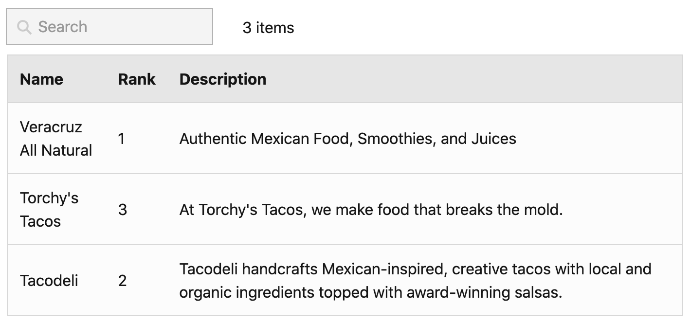
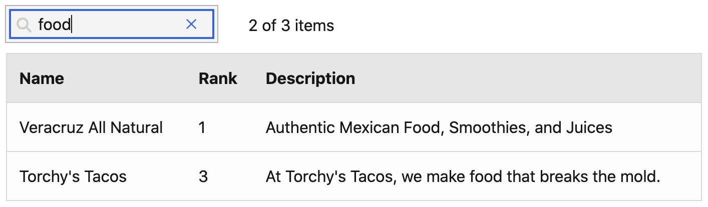
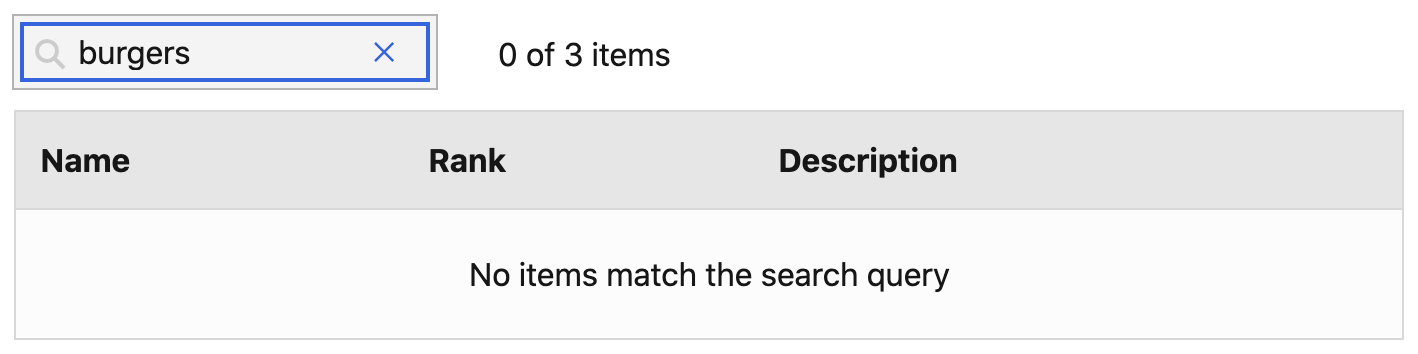
# Search
The table is leveraging BootstrapVue table
filtering (opens new window) for
search. Add the
@filtered (opens new window) event
listener onto the <b-table> component. The event callback should track the
total filtered items count.
Import the <search> and <table-cell-count> components and include them in
the template above the <b-table> component.
Include the
SearchFilterMixin (opens new window).
Add the @change-search and @clear-search event listeners on the <search>
component and use the corresponding onChangeSearchInput and
onClearSearchInput methods as the event callbacks. The table should also
include the dynamic :filter prop with searchFilter set as the value.
The <table-cell-count> component requires two properties, total table item
count and total filtered items count.
Add the :empty-filtered-text prop to the table to show the translated message
if there are no search matches.
<template>
  <b-container>
  <b-row>
    <b-col>
      <search
        @changeSearch="onChangeSearchInput"
        @clearSearch="onClearSearchInput"
      />
    </b-col>
    <b-col>
      <table-cell-count
        :filtered-items-count="filteredItemsCount"
        :total-number-of-cells="items.length"
      />
    </b-col>
  </b-row>
  <b-table
    hover
    responsive="md"
    :items="items"
    :fields="fields"
    :filter="searchFilter"
    :empty-filtered-text="$t('global.table.emptySearchMessage')"
    @filtered="onFiltered"
  />
  </b-container>
</template>
<script>
import Search from '@/components/Global/Search';
import TableCellCount from '@/components/Global/TableCellCount';
import SearchFilterMixin, { searchFilter } from '@/components/Mixins/SearchFilterMixin';

export default {
  components: { Search, TableCellCount },
  mixins: [ SearchFilterMixin ],
  data() {
    return {
      items: [...],
      fields: [...],
      searchFilter,
      filteredItems: [],
    }
  },
  computed: {
    filteredItemsCount() {
      return this.filteredItems.length;
    },
  },
  methods: {
    onFiltered(items) {
      this.filteredItems = items;
    },
  },
}
</script>
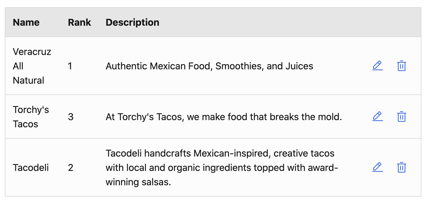
# Row actions
To add table row actions, add a column for the action buttons in the table. Then
in the array of table items, add a corresponding array of actions for each item.
The array should have each desired row action with a value and title
property.
Import the <table-row-action> component. Provide the value and title props
to the component and use the named #icons slot to include an icon. The
component will emit a @click-table-action with the event value.
<template>
  <b-table
    hover
    responsive="md"
    :items="itemsWithActions"
    :fields="fields"
  >
    <template #cell(actions)="row">
      <table-row-action
        v-for="(action, index) in row.item.actions"
        :key="index"
        :value="action.value"
        :title="action.title"
        @click-table-action="onTableRowAction($event, row.item)"
      />
        <template #icon>
          <icon-edit v-if="action.value === 'edit'"/>
          <icon-delete v-if="action.value === 'delete'"/>
        </template>
      </table-row-action>
    </template>
  </b-table>
</template>
<script>
import IconDelete from '@carbon/icons-vue/es/trash-can/20';
import IconEdit from '@carbon/icons-vue/es/edit/20';
import TableRowAction from '@/components/Global/TableRowAction';

export default {
  components: { IconDelete, IconEdit, TableRowAction },
  data() {
    return {
      items: [...],
      fields: [
        ...,
        {
          key: 'actions',
          label: '',
          tdClass: 'text-right text-nowrap',
        }
      ],
    }
  },
  computed: {
    itemsWithActions() {
      return this.items.map((item) => {
        return {
          ...item,
          actions: [
            {
              value: 'edit',
              title: this.$t('global.action.edit'),
            },
            {
              value: 'delete',
              title: this.$t('global.action.delete'),
            },
          ],
        };
      });
    }
  },
  methods: {
    onTableRowAction(event, row) {
      // row action callback
    }
  }
}
</script>
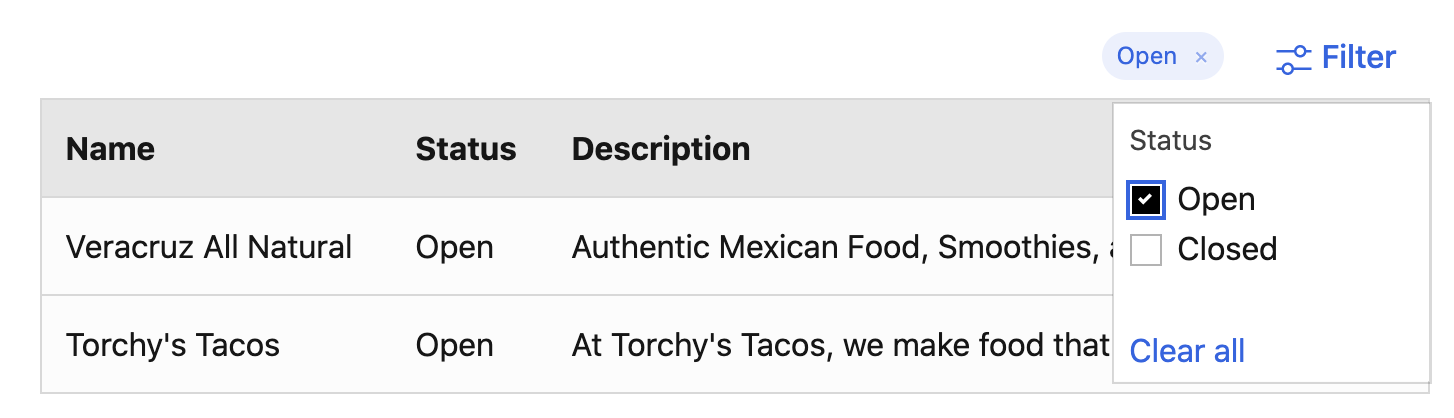
# Filters
To add a table dropdown filter:
- Import the
<table-filter>component and TableFilterMixin. - Add a filters prop to the
<table-filters>component. This prop should be an array of filter groups–each required to have a key, label, and values prop.
The label prop value should be the translated filter group label. The key
prop will usually match the filtered by table column key. The values prop
should be an array of filter values that will render as a list of checkbox items
in the dropdown.
The component will emit a @filter-change event that will provide the filter
group and all selected values in the group. Use the getFilteredTableData method
from the TableFilterMixin to show the filtered table data.
<template>
  <b-container>
    <b-row>
      <b-col class="text-right">
        <table-filter
          :filters="tableFilters"
          @filter-change="onTableFilterChange"
        />
      </b-col>
    </b-row>
    <b-table
      hover
      responsive="md"
      :items="filteredItems"
      :fields="fields"
    />
  </b-container>
</template>
<script>
import TableFilter from '@/components/Global/TableFilter';
import TableFilterMixin from '@/components/Mixins/TableFilterMixin';

export default {
  components: { TableFilter },
  mixins: [ TableFilterMixin ],
  data() {
    return {
      items: [...],
      fields: [...],
      tableFilters: [
        {
          label: this.$t('table.status'),
          key: status,
          values: ['Open', 'Closed']
        }
      ],
      activeFilters: [],
    },
  },
  computed: {
    filteredItems() {
      return this.getFilteredTableData(this.items, this.activeFilters);
    },
  },
  methods: {
    onTableFilterChange({ activeFilters }) {
      this.activeFilters = activeFilters;
    },
  },
}
</script>
# Date filter
To add a date filter, import the <table-date-filter> component. It will emit a
@change event with the user input date values. There is a date filter method,
getFilteredTableDataByDate, in the TableFilterMixin.
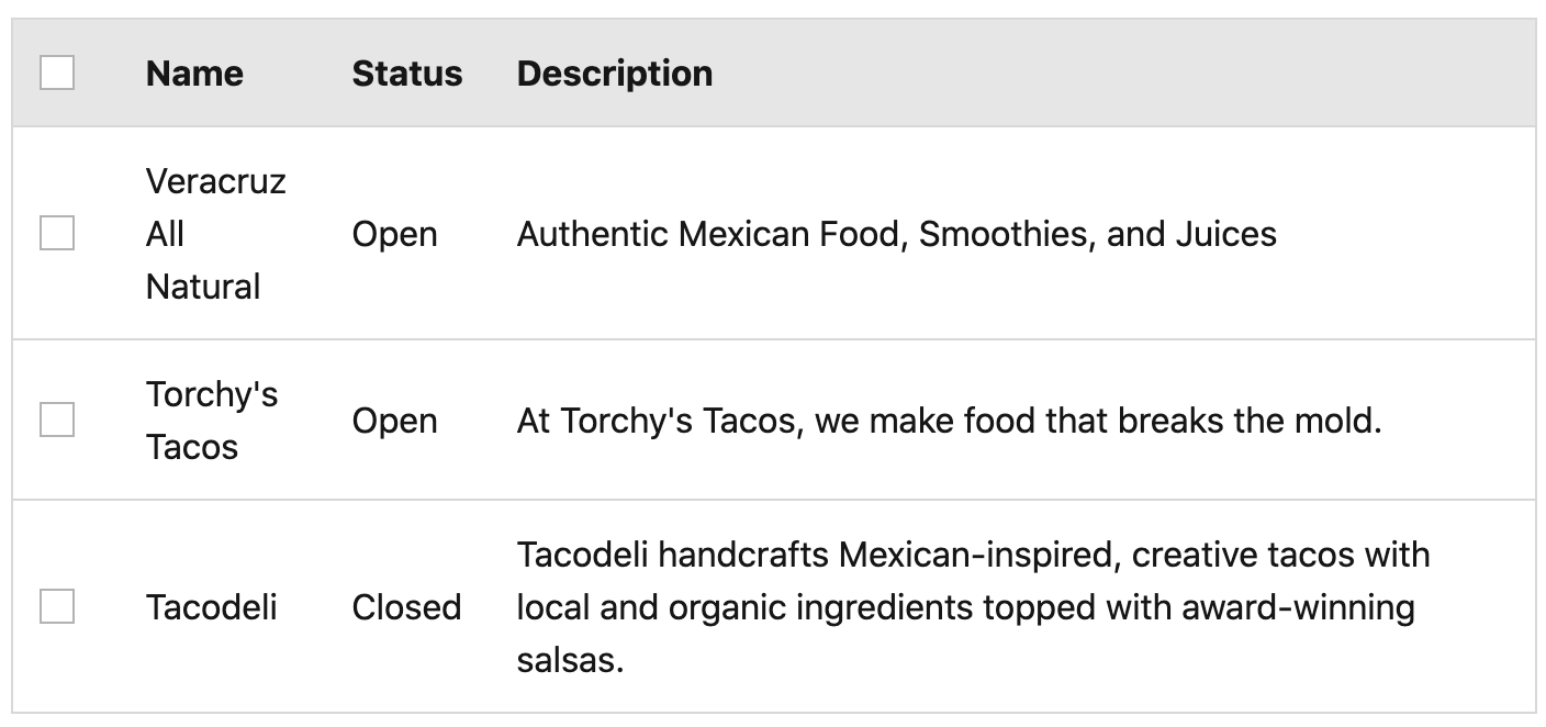
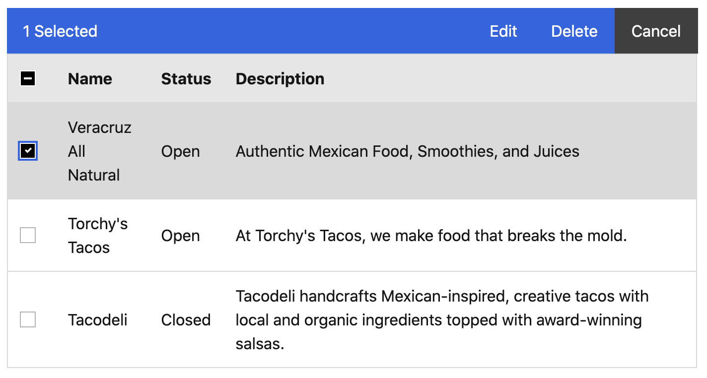
# Batch actions
Batch actions allow a user to take a single action on many items in a table at once.
To add table batch actions:
- Import the
<table-toolbar>component and BVTableSelectableMixin - Add the
selectable,no-select-on-clickprops and a uniquerefto the table. The table will emit a@row-selectedevent. Use theonRowSelectedmixin method as a callback and provide the$eventas the first argument and the total table items count as the second argument. - Add a table column for checkboxes. The table header checkbox should use the
tableHeaderCheckboxModelandtableHeaderCheckboxIndeterminatevalues provided by the mixin. The table header checkbox should also use theonChangeHeaderCheckboxmethod as a callback for the@changeevent with the tablerefpassed as an argument. The table row checkboxes should use thetoggleSelectRowmethod as a callback for the@changeevent with the tablerefpassed as the first argument and the row index passed as the second argument. - Add an actions prop to the
<table-toolbar>component. This prop should be an array of toolbar actions–required to have a value and label prop. Add theselected-items-countprop to the<table-toolbar>component. The component will emit a@batch-actionevent that will provide the user selected action. It will also emit a@clear-selectedevent. Provide theclearSelectedRowsas a callback with the tablerefpassed as an argument.
<template>
  <b-container>
    <table-toolbar
      :selected-items-count="selectedRows.length"
      :actions="tableToolbarActions"
      @clear-selected="clearSelectedRows($refs.table)"
      @batch-action="onBatchAction"
    />
    <b-table
      ref="table"
      hover
      selectable
      no-select-on-click
      responsive="md"
      :items="filteredItems"
      :fields="fields"
      @row-selected="onRowSelected($event, items.length)"
    >
      <template #head(checkbox)>
        <b-form-checkbox
          v-model="tableHeaderCheckboxModel"
          :indeterminate="tableHeaderCheckboxIndeterminate"
          @change="onChangeHeaderCheckbox($refs.table)"
        />
      </template>
      <template #cell(checkbox)="row">
        <b-form-checkbox
          v-model="row.rowSelected"
          @change="toggleSelectRow($refs.table, row.index)"
        />
      </template>
    </b-table>
  </b-container>
</template>
<script>
import TableToolbar from '@/components/Global/TableToolbar';
import BVTableSelectableMixin, {
  tableHeaderCheckboxModel,
  tableHeaderCheckboxIndeterminate,
  selectedRows
} from '@/components/Mixins/BVTableSelectableMixin';

export default {
  components: { TableToolbar },
  mixins: [ BVTableSelectableMixin ],
  data() {
    return {
      items: [...],
      fields: [
        {
          key: 'checkbox'
        },
        ...
      ],
      tableToolbarActions: [
        {
          value: 'edit',
          label: this.$t('global.action.edit')
        },
        {
          value: 'delete',
          label: this.$t('global.action.delete')
        },
      ],
      tableHeaderCheckboxModel,
      tableHeaderCheckboxIndeterminate,
      selectedRows
    },
  },
  methods: {
    onBatchAction(action) {
      // Do something with selected batch action and selected rows
    },
  },
}
</script>
# Pagination
To add table pagination:
- Import the BVPaginationMixin
- Add the
per-pageandcurrent-pageprops to the<table>component. - Add the below HTML snippet to the template. Make sure to update the
total-rowsprop.
<b-row>
  <b-col sm="6">
    <b-form-group
      class="table-pagination-select"
      :label="$t('global.table.itemsPerPage')"
      label-for="pagination-items-per-page"
    >
      <b-form-select
        id="pagination-items-per-page"
        v-model="perPage"
        :options="itemsPerPageOptions"
      />
    </b-form-group>
  </b-col>
  <b-col sm="6">
    <b-pagination
      v-model="currentPage"
      first-number
      last-number
      :per-page="perPage"
      :total-rows="getTotalRowCount(items.length)"
      aria-controls="table-event-logs"
    />
  </b-col>
</b-row>
<template>
  <b-container>
    <b-table
      hover
      responsive="md"
      :items="filteredItems"
      :fields="fields"
      :per-page="perPage"
      :current-page="currentPage"
    />
    <b-row>
      <b-col sm="6">
        <b-form-group
          class="table-pagination-select"
          :label="$t('global.table.itemsPerPage')"
          label-for="pagination-items-per-page"
        >
          <b-form-select
            id="pagination-items-per-page"
            v-model="perPage"
            :options="itemsPerPageOptions"
          />
        </b-form-group>
      </b-col>
      <b-col sm="6">
        <b-pagination
          v-model="currentPage"
          first-number
          last-number
          :per-page="perPage"
          :total-rows="getTotalRowCount(items.length)"
          aria-controls="table-event-logs"
        />
      </b-col>
    </b-row>
  </b-container>
</template>
<script>
import BVPaginationMixin, {
  currentPage,
  perPage,
  itemsPerPageOptions
} from '@/components/Mixins/BVPaginationMixin';

export default {
  mixins: [ BVPaginationMixin ],
  data() {
    return {
      items: [...],
      fields: [..],
      currentPage,
      perPage,
      itemsPerPageOptions
    },
  }
}
</script>
← StatusIcon Toasts →